With the popularity of social media, is a website for your fitness business even worth it? Short answer: yes!
Social media content is fleeting and its users’ attention short. You are at the mercy of their continuously changing algorithms, and can easily get lost in the bright and noisy void.
Maintaining a well-curated website helps boost your visibility and credibility, as well as demonstrates your professionalism and commitment to your business.
But where do you start? Let us help!
Top Recommendations for Personal Trainer Website Builders
There are dozens of platforms available now for building your own website. While they all provide similar services, it helps to know your own personal priorities (like budget or ease-of-use) when assessing the options.
Check out the pros and cons of these five popular platforms to help you analyze which personal trainer website builder is best for you.
Pros
- Easy to use drag-and-drop editor
- Artificial intelligence (AI) website builder to create a site in minutes
- Large template library
- Highly customizable
- Free option (though not recommended because your URL will be on wix.com)
- SEO (search engine optimization) tools, including Semrush keyword research
- SSL (Secure Sockets Layer) included in all plans for https:// security
- Allows collaborators
- Free domain for one year included in paid plans
- Partnered with American Council on Exercise to provide ACE-certified trainers with pre-made templates and a collection of digital tools.
Cons
- No SEO tools on free/low tiers
- Limited integration with third party apps
- Can’t change templates after site is published
- Only Business Elite plan has unlimited storage (could be a factor if you need to host a lot of videos)
- No payment processing on lower tiers
Price tiers
- Light: $17/month
- Core: $29/month
- Business: $36/month
- Business Elite: $159 per month

Pros
- Easy appointment scheduling options
- Professional appearance
- Easy to use, drag-and-drop editor
- Modern template library
- SSL included in all plans
- Free domain name for one year
- SEO & marketing tools
- Easy integration with third party extensions
Cons
- No free plans
- No stock image library
- Limited customization and very few native extensions
- Does not autosave edits
Price tiers
- Personal: $16/month paid annually or $25/month paid monthly
- Business: $23/month paid annually or $36/month paid monthly
- Commerce (basic): $28/month paid annually or $40/month paid monthly
- Commerce (advanced): $52/month paid annually or $72/month paid monthly
Pros
- Easy to use drag-and-drop editor
- Includes and combines website building, e-commerce, and marketing automation tools
- Templates, tools, and software tailored specifically for fitness professionals
- Easy and streamlined scheduling, booking, and payment functions
- AI content assistant
- Ability to upgrade, downgrade or cancel any time
Cons
- Higher monthly payments
- Limited subscribers and email sends
Price tiers
- Starter: $49/month
- Pro: $99/month
- Business: $199/month
Pros
- Free option (but you won’t get a custom domain)
- Easy to use, drag-and-drop editor
- Free domain name for one year (if paid annually)
- SEO tools
- Low cost
Cons
- Limited customization
- Subdomain – your website URL ends in WordPress.com automatically
- SSL only included in Business and eCommerce plans
- Limited selling/monetization opportunities
- Free account allows WordPress to place ads on your site and keep any revenue from them
- No plug-ins on free/low-tier plans
- SEO/Google analytics only on higher-paid plans
Price tiers
- Starter: $4/month
- Explorer: $8/month
- Creator: $25/month
- Entrepreneur: $45/month
Tip: WordPress.com vs. WordPress.org. Grow your website with your business with the WordPress software. Moving to WordPres.org allows you to implement advanced customization options, but it also means you need to find and pay for your own hosting provider, domain name, and other premium items. Learn more about WordPress.com vs. WordPress.org.
Pros
- Low cost
- Drag-and-drop editor
- Partnered with/owned by Square for excellent ecommerce abilities
- SSL included in all plans
- Easy to use with plug-ins
- Can sell products on the free or low-price plan
- Can switch themes after creation and still keep your content
- Basic SEO tools
Cons
- Limited customization
- Limited support
- Dated templates and interface
Price tiers
- Personal: $10/month paid annually or $13/month paid monthly
- Professional: $12/month paid annually or $16/month paid monthly
- Performance: $26/month paid annually or $29/month paid monthly
What Your Personal Trainer Website Should Include
Relevant Visuals
The images you use are one of the first things people will see when they visit your website. Imagery sets the tone for your message and your brand. Visuals can help build trust in you and your services as well as showcase your personality and training style.
Make sure your visuals are relevant to you. This can include short videos or photographs of you working with your clients, transformation side-by-side photos, or images of you working out or the space you work in.
Easy Navigation
Intuitive navigation is crucial to any good web design. You want to make sure visitors to your site can find what they’re looking for and move through your website as logically and seamlessly as possible.
Good navigational structure provides enhanced engagement and a better user experience overall.
Engaging and Efficient Design
Engaging visuals are important, but not to the point that they make your site look clunky, crowded, or too busy.
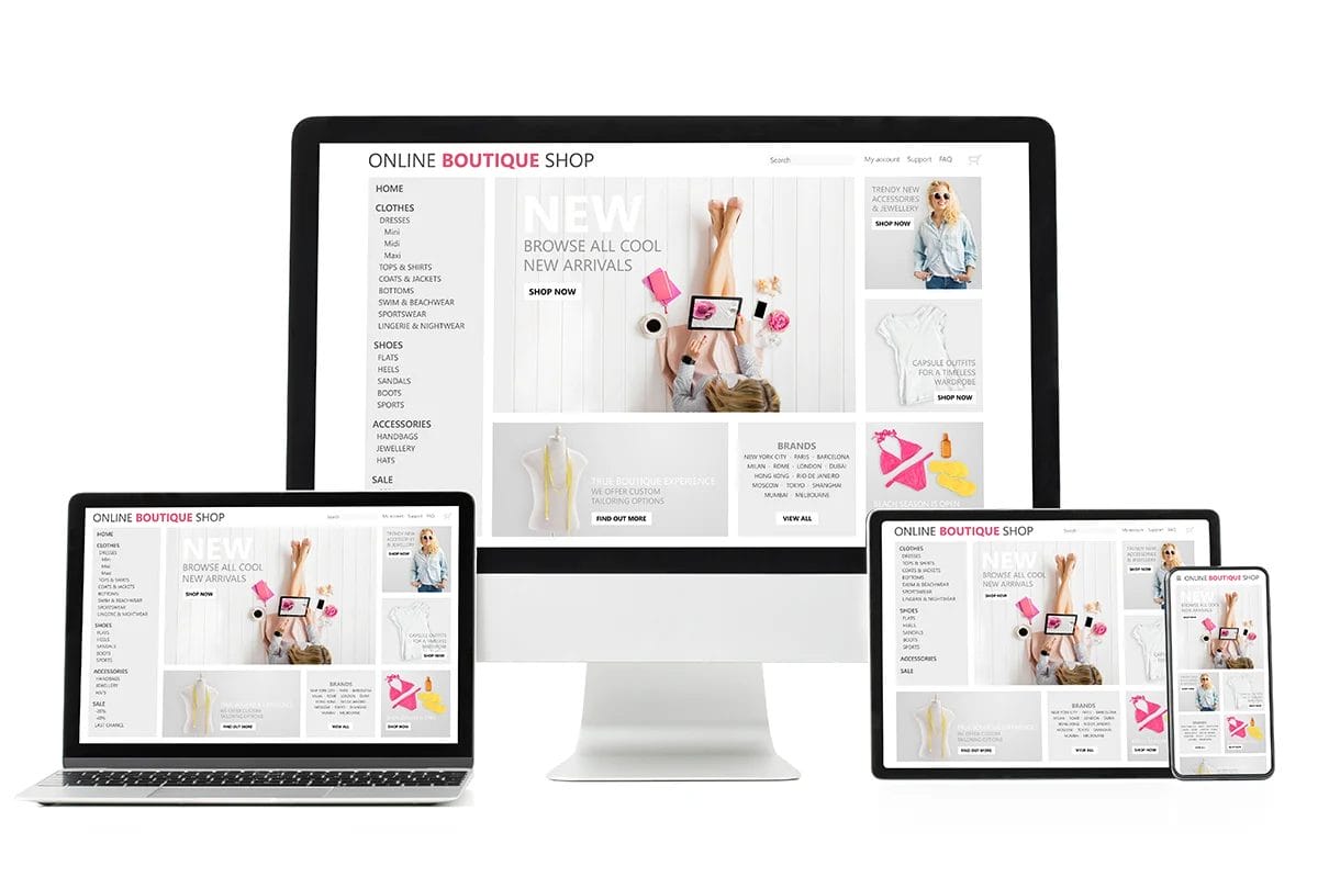
When formatting your site, strive for a responsive design that adapts well to multiple platforms. Your site should still be fluid, efficient, and usable on mobile devices as well as desktops or tablets (some website builders allow you to separately edit your mobile layout as well).
Consistent layouts, strategically positioned buttons, color palettes and appropriate, legible fonts are all key components of good design. But remember, more complex does not automatically mean better. Good design also makes use of empty space.
Comprehensive Content
Help prospective clients learn about you and the benefits of your services, as well as drive more traffic to your site, with quality, informative content.
Sections or pages to have on your site include:
- About me, with your credentials
- Testimonials and reviews
- Services you provide
- Classes or schedule if you have them
- Shopping cart/buy section if you sell online training packages
- Contact information
Many trainer sites and fitness influencers promise complete programs with expert advice, but they don’t provide the credentials to back up those claims. That’s why displaying your certifications and credentials prominently on your landing page or “About Me” page helps boost your credibility.
Reviews or testimonials showcase your clients’ success stories. Positive reviews and photos of results you helped your clients achieve builds trust in you and establishes social proof. If others enjoyed working with you, and met or exceeded their goals, chances are new or prospective clients will too.
You also want to create content with search engine optimization (SEO) basics in mind. Adding a blog to your website can help build authority with search engines if you add consistent, new and relevant content centered around your areas of expertise, community, or industry.

CTAs
Combine these principles of strategic design, easy navigation, and comprehensive content into call to action (CTA) items on your site.
CTAs can help guide your visitors around your website and encourage them to take specific actions, like contacting for more information, signing up for a newsletter, or registering for an intro session.
CTAs are typically formatted as links, buttons, and banners with action-based language. Common examples include:
- Contact us
- Schedule your first session
- Register for a class
- See class schedule
- View personal training plans
- See success stories
- Read the blog
Personal Trainer Website Examples for Inspiration
With so many website builders and templates out there, you have an infinite number of options when it comes to designing your own fitness pro site.
Here are some personal trainer sites that are crushing it!
1. Soheefit
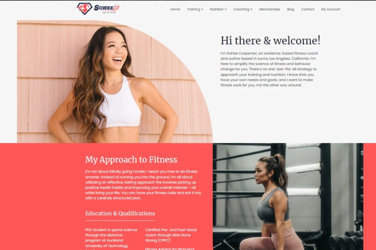
Popular fitness influencer, Sohee Lee Carpenter, has a tremendous social media following. She also has a comprehensive and informative website for conducting her business.
What we like:
- Thorough About Me section that covers her experiences, approach to coaching, and extensive education and credentials
- Blog is fresh, active, and current
- It’s designed with/for mobile devices
- Bright and professional design with multiple (but not overwhelming) call to action buttons
- Consistently welcoming and knowledgeable messaging
- “As seen in” bar with references like Women’sHealth and BodyBuilding.com
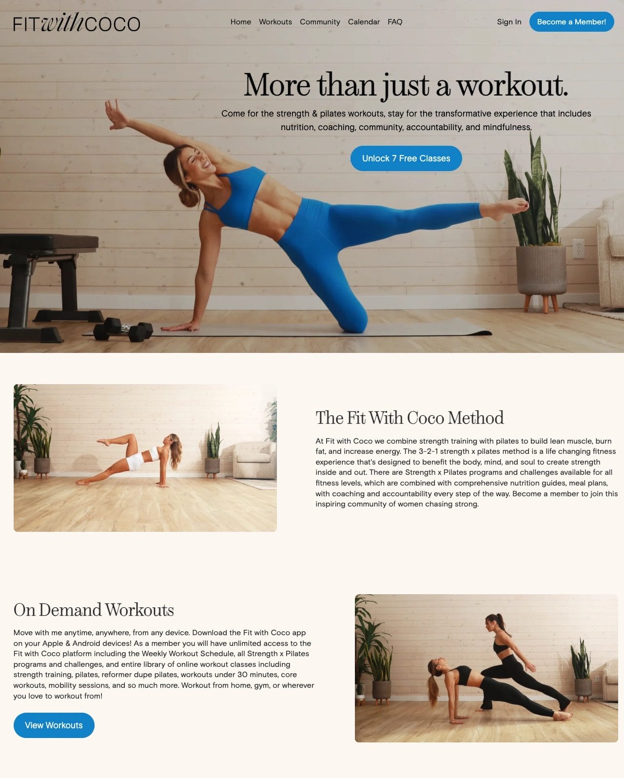
Fit With Coco is a strength and Pilates fitness program designed by instructor Courteney Fisher.
What we like:
- Clean, minimalistic design featuring versatile neutral hues
- Standout buttons draw the users’ attention to different calls to action
- Transitions from desktop to mobile well
- An emphasis on the “more than just a workout” branding
- Extensive, cohesive exercise video library that includes convenient filter options
As a bonus, her video library is also clearly labeled with fitness-level tags and includes a series of videos dedicated to form and modifications.

Just because you want your website to be streamlined and easy to navigate doesn’t mean it has to be bland or basic. You can make yourself memorable with bold designs and unique messaging.
What we like:
- Bold and memorable branding with a unique voice that stands out from the typical fitness language
- Well-executed combination of bright color and relatable voice
- Clear buying journey
- Clever testimonial display
- Witty, fresh, and fun blog
- Smart, simple graphic outlining what benefits new clients can expect at milestone marks
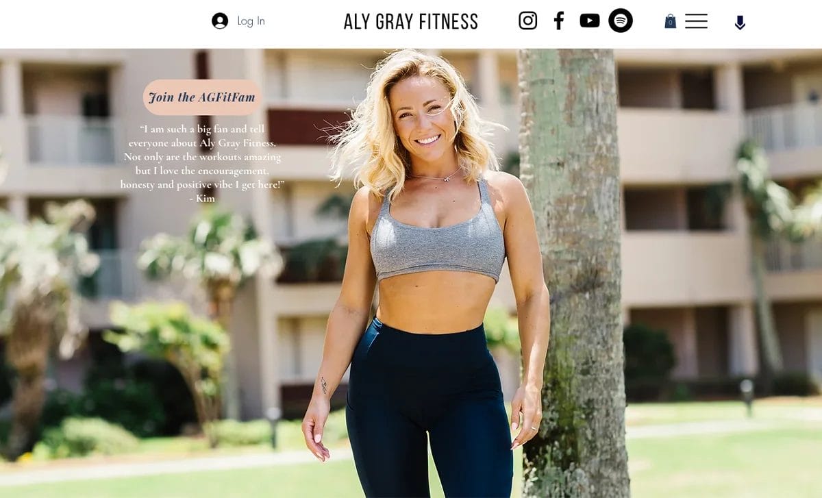
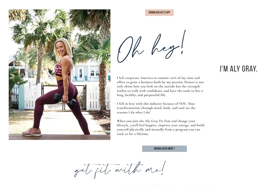
- Despite having a lot of info, site is easy to navigate
- Jump links and social media links all at the top where they can easily be found
- Bright, crisp visuals with good use of white space
- Common theme and consistent, legible color palette
- Transitions from desktop to mobile well
- Memorable, rhyming greeting and snippet introducing Aly and her work
- An emphasis on personality and the use of fonts and text to represent her voice
- List of services and multiple calls to action on her landing page
- Trust-building testimonials
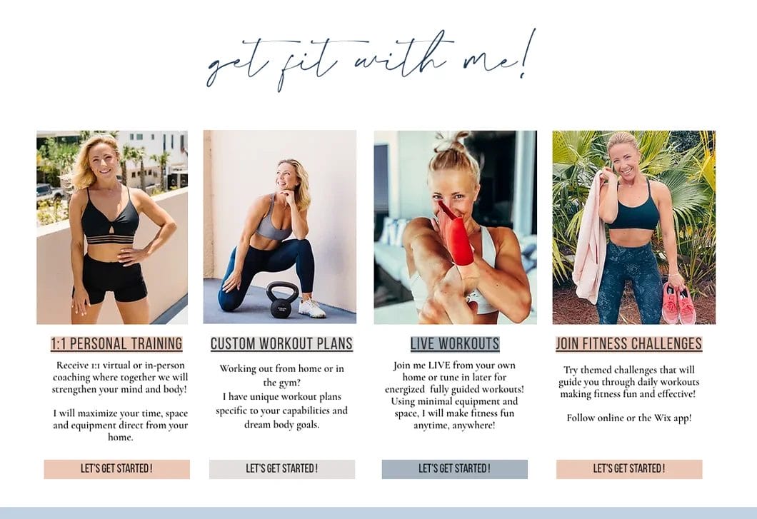
Using Your Website in Your Marketing Strategy
Your website is a resource and a tool for you, your existing clients, and potential clients. Not only does it allow clients to learn more about you, your services, and how to get in touch or start working with you, but it also lets you:
A website is one of the most important tools in your plan for marketing your fitness business.
- Generate leads via lead-capture forms and calls-to-action
- Utilize SEO to improve your internet search ranking
- Develop longer-form content like blogs, articles, ebooks, or informational videos to establish your authority and brand/image (as well as improve SEO)
- Track visitor behavior to analyze what is working for you and what’s not
- Cultivate an email database to build relationships with clients and/or prospective clients through newsletters and promotions
- Showcase more testimonials and reviews to boost your credibility and trustworthiness
FAQs About Personal Trainer Website Design
How Do I Ensure My Personal Trainer Website Is Mobile-Friendly?
Many website builders have the option to preview and test how your site is viewed on a mobile device. Some also allow you to edit your site directly in mobile view or to create mobile versions of your pages, menus, and more.
Once published, double check your personal trainer website from on your own mobile device.
How Can I Protect My Personal Trainer Website From Security Threats?
Make sure your site has an SSL (Secure Sockets Layer) certificate to encrypt data, use strong passwords and anti-malware software, and back up your site regularly. And get cyber liability insurance to help protect you in the event you do get hacked.
How Can I Integrate Online Booking and Scheduling Into My Personal Trainer Website?
Some website builders (like Wix) have pre-made page templates for scheduling, appointment bookings, etc. available. Otherwise you may need to install an additional third-party plugin or app.
What Are the Best Ways to Showcase Client Testimonials on My Website?
Banner headings, footers, hero images (images at the top of your page), sidebars, and dedicated testimonial pages are all great options to use testimonials in multiple places for maximum visibility.


